
added
Week of 06/29/2023
10 months ago by Justina Nguyen
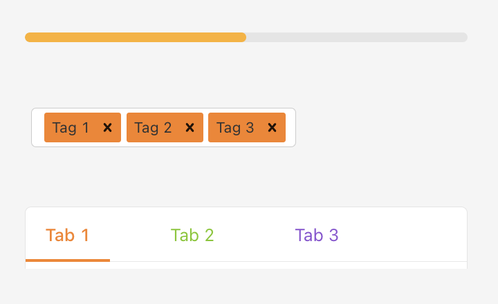
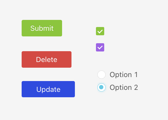
In this release, we've added the ability to customize your components with new design options. In the right-hand navigation of your Space editor under the Design tab, there is a section named Style where you can customize the colors of fill or text for select components.
Theming Updates to Components:
- Button: Customize colors for fill and text
- Checkbox: Customize colors for fill and checkbox
- File Picker: Customize colors for fill and text
- Flexbox: Option to add background with border
- Pop-up Form: Customize form layout and color for fill
- Progress Bar: Customize color for fill
- Pillbox: Customize color
- Radio Button: Customize color for fill
- S3 Uploader: Customize color
- Stat: Option to adjust size of text
- Table: Customize color of the header fill and header text
- Tag Selector: Customize colors of fill and text
- Tabs: Customize color of the bar and text
Bug Fixes:
- When component is active, clicking outside component deselects and removes hover state.
- Clicking active component no longer toggle on/off active state.
- When component is not in active state, clicking and dragging puts component into active state and remain in active state after letting go.
- When component is in active state, clicking and dragging another component moves active state to new component, and remain after letting go.
- For HTTP data sources, binary data would sometimes result in an error. It will now be returned as a base64 encoded string.
- Dragging an already selected component will deselect it upon drag finish.