
Button
Click a button to perform an action. The button component provides a quick way for users to interact with data. When clicked, buttons perform functions like calling APIs, updating data or inserting new data.
Ways to use a Button
Add in-line actions
You can add an in-line button (child component) to a table, detail view, or card list (parent component). The button is automatically displayed for every record in the parent component.
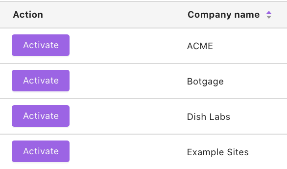
Examples:
Let's say you have a table in your Space displaying Companies. A button can be inserted in-line within each row, labeled "Activate". Clicking a button in a row would use the data in that row as inputs to execute a function that will activate the company.
Get inputs from multiple components
You can configure buttons to take inputs from a single component or multiple components.
Example:
You have a table of Customers and a table of Products. Let’s say you want to create a tool that will hit your company’s Orders API endpoint with a customer ID and a product’s serial code, to create an Order. You can set up a button that will use the customerID from the Customers table and the serial_code from the Products table as inputs.
Set specific values on click
Buttons can be configured to always set a certain value.
Example: You have a User record and you want a way to easily turn the plan_type to “Premium”. You can set up a button and configure the value of the plan_type field to be “Premium”.
If you want to allow users to verify the inputs before submitting or input their own values, use a form componentinstead.
Bind its results to another component
The results of the function performed by the button can be displayed in another component, like a table or detail view. Within the other component's configuration, select "Binding" and then choose this button component.
Configuring your Button
Source
First, select the function that this button should trigger when a user clicks on it.
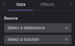
For most databases, you'll see auto-generated insert, update, and delete functions. For example, if you selected your PostgreSQL database with a Users table, you'll see "insert Users record", "update Users record", and "delete Users record" functions appear automatically.
Note:
If you do not see auto-generated functions, check to see if the database credentials used to connect has permission to insert, update, and delete.
For most business apps, auto-generated functions will appear, based on the available APIs of that app. For an app like Stripe, you'll see functions for "insert Balance Transactions record", "update Balance Transactions record", "delete Balance Transactions record", and so forth for the resources available in Stripe's API.
If you created any custom functions for a database or HTTP service, those will also be available for you to choose from.
Text
You can give your button a name (used to reference this component within Internal). Then, you can select an icon for your button (optional) and enter in the text to be displayed on the button.
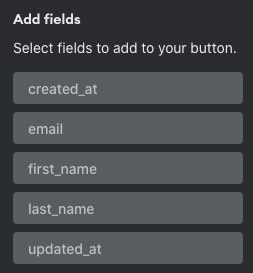
Fields
Here you'll specify the actual inputs that are passed along when the button is clicked. To do this, you’ll select fields, and then specify what values go in them.
Select fields
By default, only required fields are added. For example, If you’re updating a record in a database, this would just be the primary key. Click “+” to view a list of all available fields for your selected function.
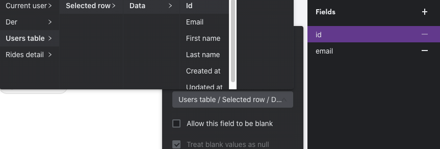
Specify values
You’ll need to choose a value that is passed in for each field. Click the field to bring up options. You can get this value from an existing component, set a custom default value, set a UUID, set to null, or set to the date-time the button is clicked (date/time fields only).
In the example below, we’ve chosen to set the value of the “id” field with the “id” of the selected row of the Users table (which is a table component in this Space).
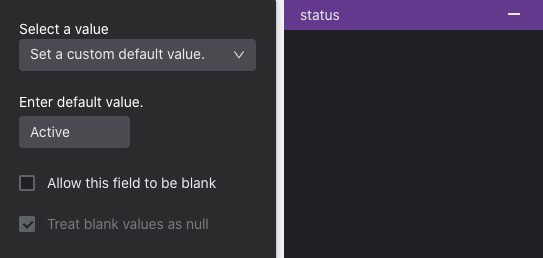
In this next example, we’ve chosen to always set the status field’s value to “Active”.
Check out Field Configuration to learn more.
Visibility Rules
You can create visibility rules that will determine when this component is visible and able to be interacted with.
Effects
You can customize the effects attributes of the Button component.
Auto Update by Key
This is the default state for "Effects" for this component. When the component submits its data successfully, components that are bound to that function will automatically be updated by key (e.g. Sending an email-address update to a user's table should result in the updating of associated row table data associated with that key.)
Design
You can customize the design attributes.
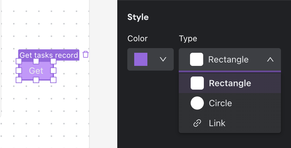
Type: You can change the type and shape of your button using the configuration dropdown in the bottom right of the menu:
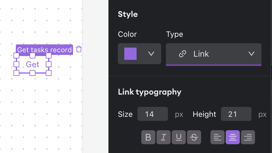
Of the types, Link is unique -- It can be configured just as normal text elements are in your Spaces:
Updated about 1 year ago