
Checkbox
The Checkbox component allows the user to check a box to pass a specific value.
Ways to use a Text Area
Use it with a forms
Add a checkbox to a form and allow users to check a box to specify a boolean value.
Provide an input value for several components filters
By binding a checkbox to multiple components (such as tables, detail or card lists), multiple sets of data can be filtered on a single boolean value.
Use its value to pre-fill fields in another component
Sometimes you may want to use the selected boolean value in other components like buttons or forms.
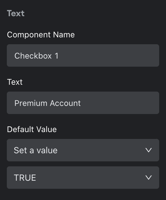
Configuring your Checkbox
To configure your checkbox, first give your component a name and text that appears next to the text box.
Next, set a default value. This step is optional but useful if you want the checkbox to be default checked. Select “Set to value” to choose True or False as the default. Otherwise, choose “Set a template”. A template allows you to enter in a value, insert a variable (i.e. bind to a value in another component in your app), or do a combination of both.
You can also set visibility rules for your radio button if you want it to appear only if a set of conditions are met.
Design
You can customize the design attributes.
Updated about 1 year ago