
Radio Button
The Radio Button component allows the user to choose only one of a predefined set of options.
Ways to use Radio Buttons
Use it with a forms
Add a Radio Button to a form and define the values you want to make available. This allows the user to easily select from a predefined set of options and submit the value.
Provide an input value for several components filters
By binding a radio button’s selected value to multiple components (such as tables, detail or card lists), multiple sets of data can be filtered on a single criteria.
Use its value to pre-fill fields in another component
Sometimes you may want to use the selected value of a radio button component in other components like buttons or forms.
Configuring your Radio Button
To configure your radio button, first give your component a name.
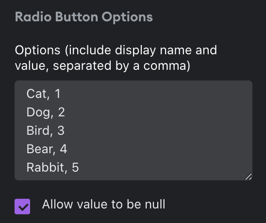
Next, you’ll need to configure the Radio Button options. Enter the display name and the actual value that will be passed through, separated by a comma. If you want a null option to be present, click to checkbox “Allow value to be null”.
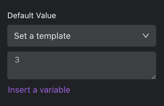
Next, set a default value. This step is optional but useful if you want a specific option pre-selected in the UI. Select “Set to null” to make the default selection “Null”. Otherwise, choose “Set a template”. A template allows you to enter in a value, insert a variable (i.e. bind to a value in another component in your app), or do a combination of both.
You can also set visibility rules for your radio button if you want it to appear only if a set of conditions are met.
Design
You can customize the design attributes of the Radio Button component.
Updated about 1 year ago