
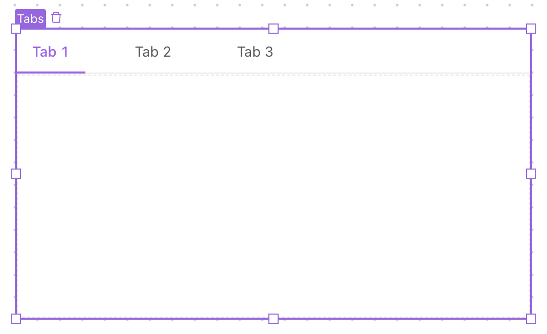
Tabs
The Tabs component allows you to create a collection of components grouped into a single location and resigned to individual tabs. This is especially helpful for situations like grouping various workflows into tabs, allowing for quick switching of contexts within a space.
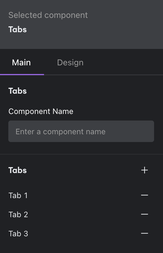
Add multiple tabs to the component by clicking on the plus icon.
By default, each tab includes a Flexbox component. This allows greater flexibility of layout within each tab. We recommend adding components inside of the Flexboxes.
Design
You can customize the design attributes of the Tabs component.
Updated about 1 year ago