
Text Area
The Text Area component allows the user to input longer form text.
Ways to use a Text Area
Use it with a form component
Add the text area to a form if you need users to provide an input that is potentially multiple lines of text.
Use its value to pre-fill fields in another component
Sometimes you may want to use the text area’s value in other components like buttons or forms.
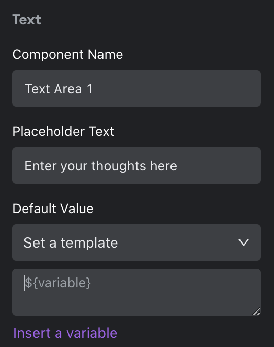
Configuring your Text Area
To configure your text area, first give your component a name and placeholder text.
Next, set a default value. This step is optional but useful if you want text pre-filled in the text area. Select “Set to null” to make the default selection “Null” and “Set to UUID” to make the default a auto-generated UUID. Otherwise, choose “Set a template”. A template allows you to enter in a value, insert a variable (i.e. bind to a value in another component in your app), or do a combination of both.
You can also set visibility rules for your radio button if you want it to appear only if a set of conditions are met.
Design
You can customize the design attributes.
Updated about 1 year ago